Architectural Ink Rendering, How to Draw Interiors by Hand Using Marker Pens
/
Rendering by hand with ink marker pens
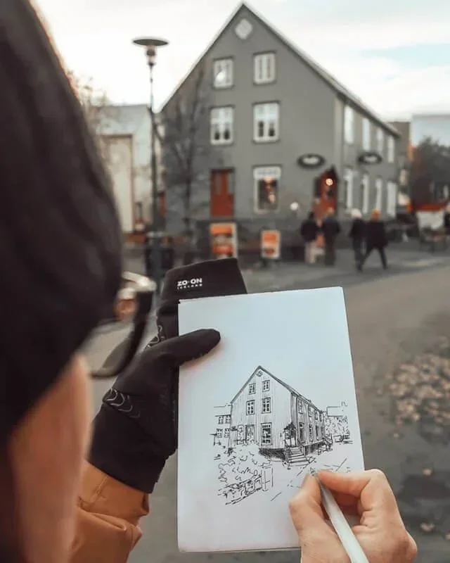
Over the last few weeks, I’ve been creating a series of hand-rendered drawings for my Design Communications class. I always believe it’s important to show students my own work rather than pulling examples from Google. It builds trust and shows that the techniques I teach are grounded in real practice.
In today’s fast-paced design world, it’s easy to jump straight to the computer. While software like Photoshop is an industry standard, learning to render by hand first deepens understanding of light, shadow, materiality, and proportion. Hand-rendered drawings have a warmth and clarity that digital tools often struggle to replicate.
If you’re working on building your overall skills, start with my complete guide on improving your architecture drawing skills, where I break down the foundations step by step.
In this post, I’m sharing my process for architectural and interior ink rendering, the marker pens and paper I use, and practical tips to help you start creating your own hand-rendered drawings with confidence.

Ink Marker Pens for Interior Design Rendering
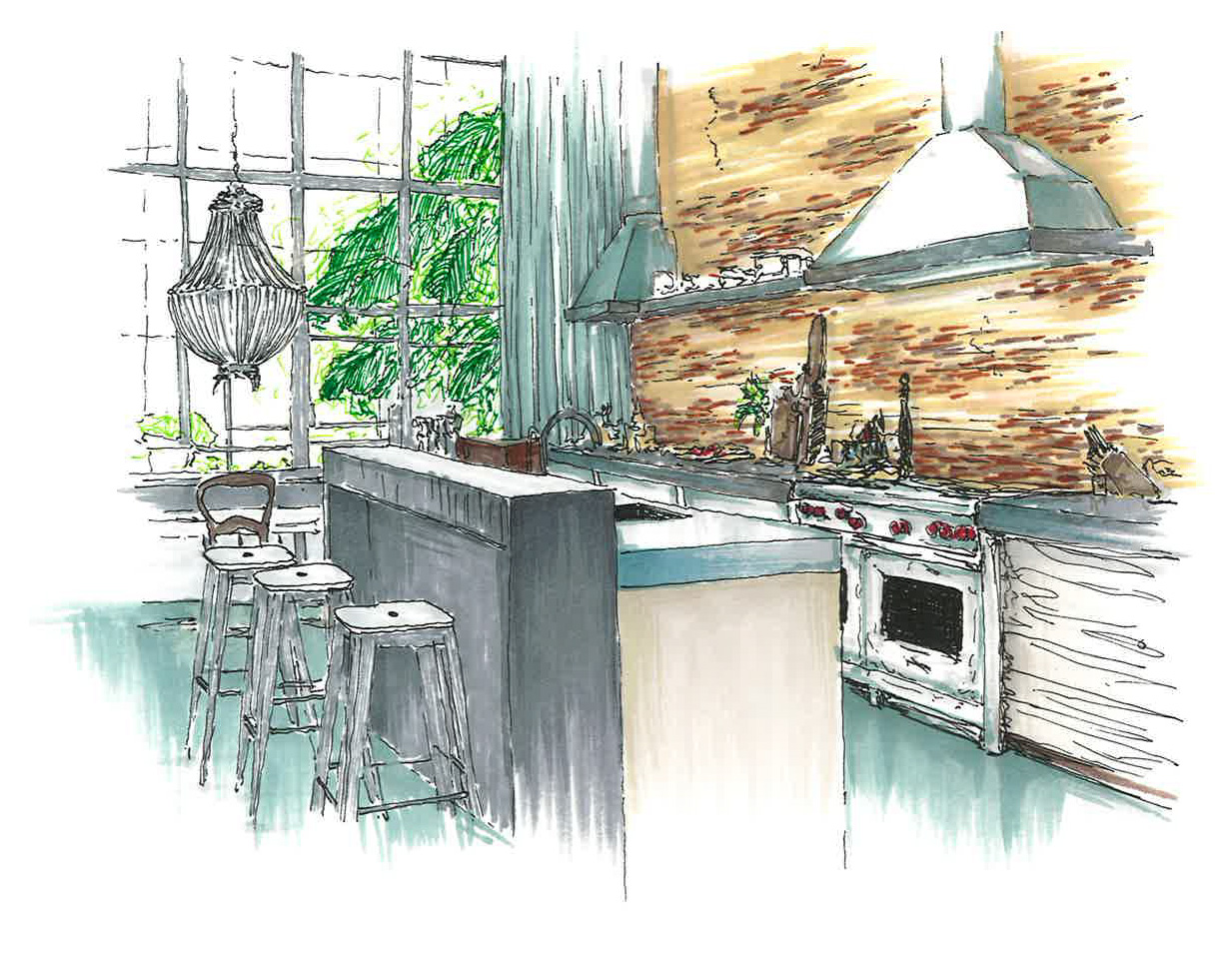
Over the years, I have built up a small collection of marker pens, from ProMarkers and Tria to my current favourites, Copic markers. I am not loyal to a single brand - for me, colour range and ink flow matter most. Whatever I have to hand often does the job perfectly.
If you are just starting, I recommend investing in 3 to 4 essentials:
A light grey and a darker grey for shadows and depth
A warm brown for wood tones
A blender pen, if the budget allows
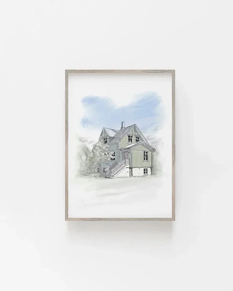
You can also layer in details with coloured pencils over your marker work; it adds texture and subtle variation that brings an image to life.

Choosing the Right Paper for Ink Rendering
Working with marker pens can feel intimidating at first, but it gets easier with practice. My biggest tip is to always make multiple copies of your line drawing before you start rendering, that way you can experiment without the fear of ruining your work.
Paper choice can make or break your result. Poor-quality paper causes the ink to bleed, feather, or soak through, while thin sketchbook paper can warp or become semi-transparent. I have had the best results using:
Thick card stock with a smooth finish
Watercolour paper with light absorption, great for layering ink
Marker pads are ideal, but often pricey if you are not using them regularly
Look for a smooth surface to avoid streaking, and always test your markers on a scrap before starting.
Try It Yourself
If you have never worked with marker pens, remember, less is more. Build up your tones gradually. Add a wash of your lightest colour first, step back, then layer in mid-tones and shadows. Keep checking your work from a distance so you can see the balance of colour and contrast.
If you do not have your drawing to render, take an image from a design magazine, sketch it out with a fine liner or pencil, and start there. Begin with light tones, then layer darker colours for depth, adding texture and highlights last.
The hardest part is knowing when to stop. It is tempting to keep adding more, but sometimes the most beautiful results come from restraint, allowing the white of the page and the looseness of the lines to shine through.