
Write Like an Architect
Architectural lettering made simple, so your drawings, plans and portfolio pages look cleaner, clearer and more professional. Trusted by 8,000+ architecture and design students worldwide.
If you’ve ever looked at a drawing and felt your handwriting was letting the whole page down, you’re not alone. Architectural lettering isn’t a talent you’re born with. It’s a skill you can learn, practise and improve surprisingly quickly with the right guidance.
Download the free workbook and start building clean, confident lettering today.
Learn the simple rules architects use for clear, consistent lettering
Practice with guided worksheets you can print and repeat
Make your drawings and portfolio pages look polished, fast
Created by Sonia Nicolson, British Chartered Architect & former university lecturer.
I’ve taught thousands of students, and architectural lettering is one of the quickest ways to make drawings look more professional.
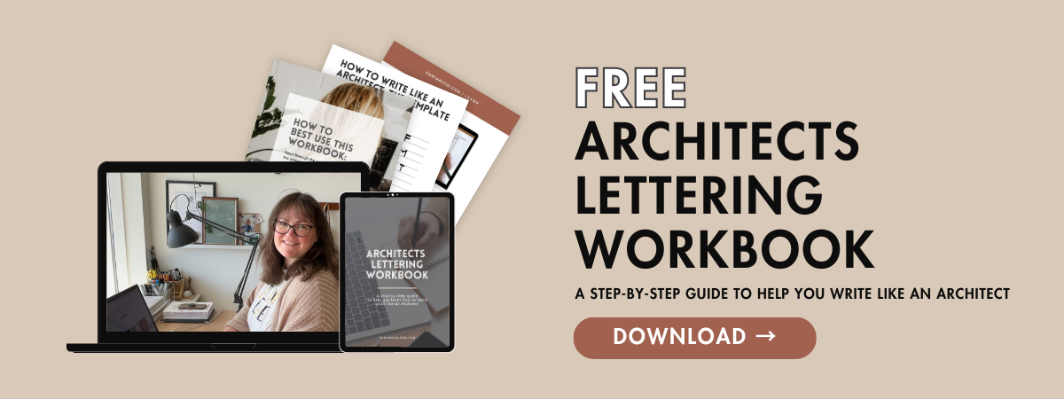
Free workbook
Write Like an Architect, free workbook
A practical, printable workbook that teaches you the foundations of architectural lettering, step by step.
What’s inside
The core lettering rules used in studio and practice
Spacing, rhythm, and consistency (the real secret)
Line weights and pen choices that actually work
Guided practice sheets you can repeat anytime
Common mistakes, and quick fixes that improve everything
Instant access, no spam. You can unsubscribe anytime
Start here
Architectural lettering, the basics
Architectural lettering is designed to be clear, fast to read, and consistent across drawings. Here are the foundations.
Pick one style and repeat it. Choose simple uppercase lettering to start. Consistency beats personality in technical drawings.
Keep the height consistent. Aim for one lettering height per drawing type. For example: Titles = larger, Notes = medium, Dimensions = smaller. The exact size matters less than keeping it consistent.
Slow down for 60 seconds. Most messy lettering is rushed. Give yourself a tiny “lettering pace shift”, especially at the start of a page.
Also read Best Pens for Architectural Lettering and line weights
Tools I recommend for clean lettering
You do not need expensive supplies. Start with what you have, and upgrade only when you’re ready.
A simple starter setup
A pencil you like for guidelines
A fineliner (or two sizes) for notes and titles
A ruler for baselines when you need extra neatness
Quick tip
If your lines wobble, don’t fight it. Use lighter pressure and let your hand glide, not grip.
Practice sheets and quick wins
Want the fastest improvement? Repeat the same short practice, little and often.
Try this 5-minute routine
1 minute of straight strokes
1 minute of curves and circles
2 minutes of the same word repeated (your name, “SECTION”, “KITCHEN”)
1 minute of a full sentence in caps
Where architectural lettering matters most
If you’re a student, this is where lettering gives you the biggest return.
Portfolio pages, headings and captions
Plans, sections, elevations, annotations
Diagrams, concept boards, presentation slides
Any drawing where clarity affects your grade or your client’s confidence
Want help with your portfolio as well?
If you’re working on university applications, placements, or interviews, your lettering is only one part of the bigger picture. I also help students build confident portfolios that show process, clarity, and design thinking.
Options
Portfolio reviews (personal feedback and next steps)
Portfolio templates (clean layouts with built-in guidance)
Portfolio course (what to include, how to structure it, how it’s assessed)
Frequently asked questions
Do I need perfect handwriting to study architecture?
No. You need consistent, legible lettering. That’s a learnable skill.
Should I letter in all caps?
All caps is the simplest to learn and the clearest on drawings. Once you’re confident, you can develop your own style.
What if my lettering is always uneven?
Use light pencil guidelines for height and baseline, then ink once. Your eye will train quickly.
How long does it take to improve?
Most students see a noticeable improvement within 1 to 2 weeks of short daily practice.
Can I use digital lettering instead?
Yes, but learning the foundations still helps, even if you letter digitally. The rules stay the same.
Download the free workbook
If you want your drawings to look more professional without overthinking it, start here
Hand drawing is a creative superpower, and clear lettering is part of that craft.
