Best Pens for Architectural Lettering and line weights
/If you’re studying architecture or interior design, one of the fastest ways to elevate your drawings is through clear architectural lettering and confident line weight. And yet, this is something most students are never properly taught. Instead, you’re expected to just know what pens to use, how thick your lines should be, and how to make your drawings look clean and professional. So you end up guessing.
I see this all the time in portfolio reviews. The truth is, your tools do matter, but it’s not about having loads of expensive pens. It’s about choosing the right pens, understanding line weight, and learning how to use both intentionally.
In this guide, I’ll walk you through:
The best pens for architectural lettering and drawing
What I recommend for first-year students
How line weight works (and why it matters)
Simple tips to instantly improve your drawings
And if you want to improve your handwriting straight away, you can download my free Architect’s Lettering Workbook.
Why Your Pens Matter (More Than You Think)
In architecture, your drawings are how you communicate your ideas. Before anyone reads your concept or listens to your explanation, they see your work.
Messy lettering or inconsistent line weight can make even a strong design feel unclear or unfinished. Whereas clean lettering builds confidence, consistent line weight improves readability, and good drawings stand out in tutorials and portfolios.
Even though the same applies in your CAD drawings, learning this first when hand drawing is still such a powerful skill - even in a digital world.
Best Pens for Architectural Lettering and Line Weight
Here are the pens I recommend (these are industry-standard and student-friendly):
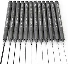
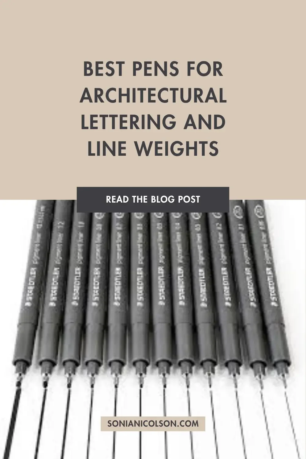
1. Staedtler Pigment Liner
A reliable, affordable, and widely used fineliner.
Why it works:
waterproof and fade-resistant
consistent ink flow
available in multiple nib sizes
Best for beginners, everyday sketching, and architectural lettering.
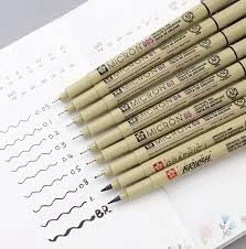
2. Sakura Pigma Micron
A favourite among architects, illustrators, and designers.
Why it works:
very precise nibs
great for fine detail
smooth, controlled lines
Best for detailed drawings, line weight control, and portfolio work.
3. Uni Pin Fineliner
A slightly more robust pen with a strong nib.
Why it works:
durable tips
clean, sharp lines
good value
Best for heavier drawing and beginners who press harder.
Pen | Best For | Recommended For
Staedtler Pigment Liner | Everyday drawing | Beginners
Sakura Pigma Micron | Detail work | Portfolios
Uni Pin Fineliner | Durable everyday use | Students who press harder
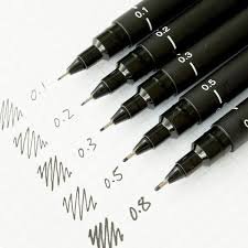
How I Choose Pen Sizes When I Draw
Students often ask whether they need a huge collection of pens. My answer is always no. When I was teaching architecture students, I encouraged them to start with just three sizes:
0.1 for lettering and fine detail
0.3 for general drawing
0.5 for outlines and cut elements
The best pen is the one that helps you communicate your ideas clearly - not the most expensive one on the shelf. Learning how to use these confidently is far more valuable than buying every pen available.
Choosing the right pens is only half the story. Once you have the right tools, understanding line weight is what makes architectural drawings look clear, professional and easy to read.
What is Line Weight in Architecture?
Line weight refers to the thickness of lines in your drawing, used to show hierarchy, depth, and importance. Instead of drawing everything the same, architects vary line thickness to guide the eye to what's more important in a drawing.
For example, thick lines - elements being cut (walls in plans), medium lines - visible edges, and then thin lines - detail, furniture, annotations.
Why Line Weight is So Important
Without line weight, drawings feel flat and confusing. With line weight, drawings become easier to read, key elements stand out, and your work looks more professional instantly.
It’s one of the simplest ways to improve your drawings overnight.
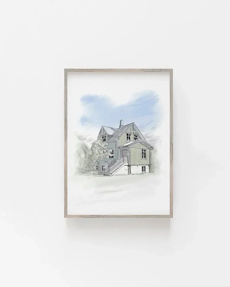
Simple Line Weight Example
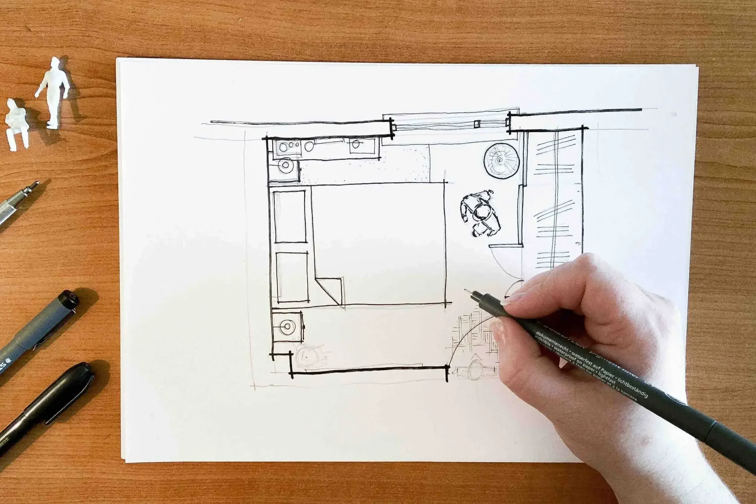
In this example:
The walls are drawn with a thicker pen (0.5)
Doors and furniture use a medium line (0.3)
Smaller details and annotations use a fine line (0.1)
This creates a clear visual hierarchy.
Tips for Better Architectural Lettering
Write in uppercase for clarity
Keep spacing consistent
Use guidelines if needed
Slow down - neatness over speed
Practice regularly (this is a skill you build)
If you want structured practice, download my free workbook here
Tips for Improving Line Weight
Don’t press harder - change pen size instead
Be consistent across the drawing
Think about what is most important
Use thicker lines sparingly
Practice with simple sketches first
FAQ
-
You don't need an expensive collection of pens to produce professional-looking drawings. I usually recommend starting with three fineliners: 0.1 for lettering and fine detail, 0.3 for general drawing, and 0.5 for thicker outlines. These three sizes will cover most first-year architecture projects.
-
Different pen sizes help create line weight, which makes drawings easier to read.
As a simple guide:
0.1 – lettering, dimensions and fine details
0.3 – general drawing
0.5 – walls, outlines and elements you want to emphasise
The exact sizes matter less than using them consistently.
-
Line weight helps people understand your drawing more quickly.
Instead of every line competing for attention, thicker and thinner lines create a visual hierarchy. Throughout my years teaching architecture students, I've found it's one of the quickest ways to make a drawing look clearer and more professional.
-
No.
Good tools are helpful, but they won't replace good drawing habits. I'd much rather see a student using three affordable pens confidently than a drawer full of expensive supplies they don't know how to use.
-
Absolutely. The pens I recommend are suitable for architectural lettering, technical drawings and sketching. As your confidence grows, you'll naturally discover which sizes you reach for most often.
Final Thoughts
You don’t need to be “naturally good” at drawing to improve this. These are learnable skills. With the right pens and a basic understanding of line weight, your drawings will immediately look more confident, clear, and professional. And honestly, this is one of the biggest differences I see between students who stand out and those who don’t.
Remember...
Your drawings don't become professional because you bought better pens. They become professional because you understand how to communicate your ideas clearly. The tools support the skill - they never replace it.